

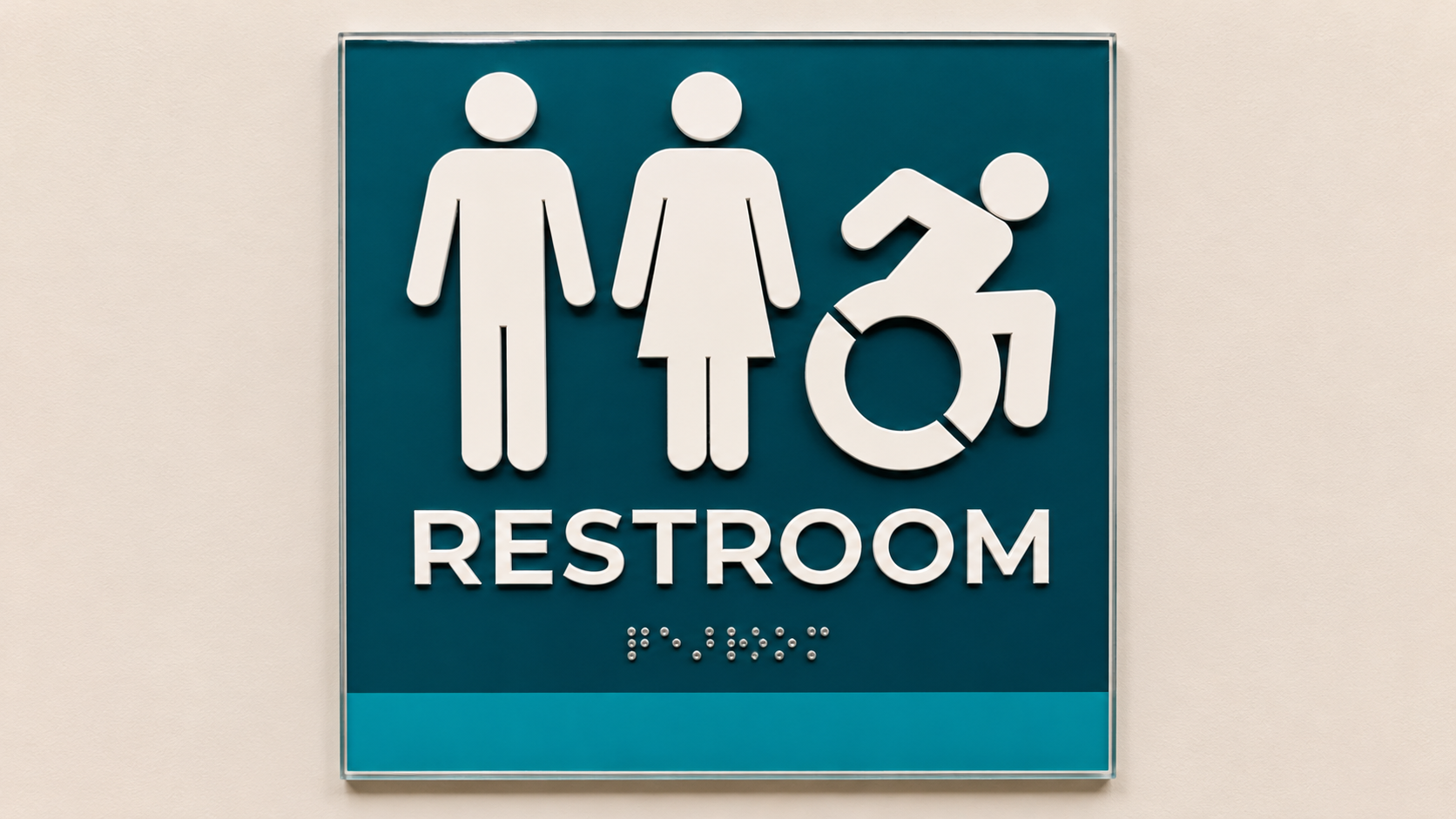
What signs does a medical or dental office need?
Most medical and dental offices need an exterior suite or building sign, an identifiable reception area, ADA-compliant room signs, restroom signs, directional wayfinding, safety and regulatory notices, and changeable identification signs. Planning these elements as one coordinated system improves accessibility, reduces patient confusion, and creates a consistent brand experience.
Medical office signs do more than identify rooms. They help patients find the correct entrance, navigate an unfamiliar building, understand where to check in, and move through the office with greater confidence. A complete sign plan should account for accessibility, patient privacy, daily operations, and branding before fabrication begins.
A complete medical office sign plan begins with the patient journey
The best way to evaluate medical office signs is to follow the same path a first-time patient takes. Start at the street or parking lot and continue through the entrance, reception area, treatment rooms, restrooms, and exit.
Use this sequence as a planning checklist:
1. Property entrance: Monument signs or tenant panels identify the medical campus or building.
2. Parking area: Directional signs point to patient parking, accessible spaces, drop-off zones, and designated entrances.
3. Building exterior: Building, door, or suite identification confirms that the patient has reached the correct office.
4. Reception area: A branded lobby sign makes check-in immediately recognizable.
5. Interior routes: Directional signs guide patients to departments, exam areas, imaging, laboratories, restrooms, and exits.
6. Permanent rooms: Tactile room-identification signs help identify spaces with permanent functions.
7. Flexible spaces: Changeable signs accommodate rotating providers, changing departments, and multipurpose rooms.
8. Exit path: Clear directional and exit information completes the journey without forcing patients to retrace their steps.
For multi-tenant properties, exterior monument signs should use readable tenant identification and a clear information hierarchy. Trying to display too many names at the same visual weight makes the sign less useful from a moving vehicle.
ADA signage identifies permanent rooms and accessible spaces
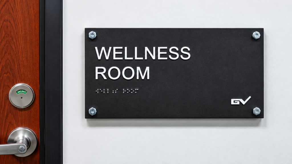
ADA signage is a core part of a medical or dental office sign package. Under the federal ADA Standards for Accessible Design, signs identifying permanent rooms and spaces generally require tactile characters and Grade 2 Braille. Examples commonly include restrooms, exam rooms, consultation rooms, utility rooms, and permanent office spaces.
A compliant sign involves more than adding Braille. The design and installation must account for:
• Raised tactile characters
• Grade 2 Braille
• Non-glare backgrounds and characters
• Sufficient visual contrast
• Compliant character styles and proportions
• Proper mounting height and location
• Placement where an open door will not obstruct access to the sign
Not every directional or informational sign requires tactile characters, but visual signs still need to be readable. Because requirements depend on a sign’s function and location, the sign schedule should classify every sign before design and production begin.
Explore Mtn High Signs + Design’s ADA signage capabilities when planning room identification, restrooms, and accessible routes for a Denver-area healthcare facility.
Branding can extend across the entire sign system
Compliance does not require a medical office to look institutional. Colors, shapes, materials, typography, and graphic accents can connect room signs, directional signs, reception signage, and exterior identification to the practice’s brand.
“With ADA, wayfinding, lobby, and monument signs, you have an opportunity to incorporate your brand identity into every piece. Adding those elements often does not significantly increase the price, and it creates a more unified look for the office.”
The practical approach is to build branding around accessibility rather than compete with it. A practice can use its brand colors while preserving required contrast, repeat a recognizable shape without compromising tactile information, and coordinate sign materials with the interior architecture.
Planning a new office or replacing disconnected signs? Mtn High Signs + Design can develop a coordinated package covering design, code and permit coordination where applicable, fabrication, installation, and future maintenance. Begin with the required-room list and patient route so the finished system solves operational needs as well as visual ones.
Room IDs should distinguish permanent and changeable information
Medical and dental offices frequently combine fixed room functions with information that changes. Those two information types should not automatically be placed on one permanent plaque.
A practical room-sign strategy uses:
• Permanent tactile signs for fixed room numbers or functions
• Changeable inserts for provider names and schedules
• Sliding vacancy indicators for consultation or treatment rooms
• Replaceable panels for departments likely to move
• Privacy-conscious identifiers that avoid exposing unnecessary patient information
For example, a Denver-area specialty clinic may assign a permanent tactile room number to each exam room while using replaceable inserts for the providers working in that area. The clinic can update staffing without replacing its complete ADA sign system.
Wayfinding should reduce decisions at every intersection
Effective healthcare wayfinding does not attempt to provide every instruction on every sign. It gives patients the next decision they need at the exact point where they need it.
Use consistent destination names throughout the facility. If the lobby directory says “Diagnostic Imaging,” hallway signs should not switch to “Radiology” unless both terms are intentionally displayed. Keep arrows, typography, colors, and room-number conventions consistent.
Useful destinations may include:
• Reception and check-in
• Dental operatories or exam rooms
• Imaging and laboratory services
• Consultation and treatment areas
• Restrooms and accessible routes
• Elevators, stairs, and exits
• Billing or administrative offices
• Pharmacy or patient pickup areas
Test the proposed system with someone unfamiliar with the building. If that person must stop and ask for help at a corridor, elevator, or department entrance, the route needs another confirmation sign or a clearer destination name.
Exterior and suite signs must account for property rules
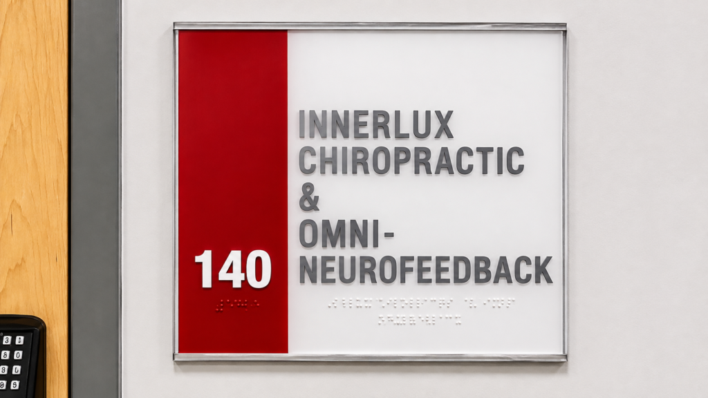
Exterior medical office signs may involve landlord criteria, sign-program standards, municipal permits, electrical requirements, or installation restrictions. These issues should be checked before final design approval—not after fabrication.
Depending on the location, an office may need:
• Building-mounted identification
• Illuminated channel letters or cabinet signs
• Door and window graphics
• Suite numbers
• Monument-sign tenant panels
• Parking and entrance directions
• Temporary opening or relocation signs
A full-service Denver-area sign shop can coordinate these exterior requirements with the interior sign package, preventing differences in naming, colors, logos, or suite information.
A final sign audit prevents expensive omissions
Before approving production, verify the sign plan against this checklist:
• Every permanent room has been classified.
• Accessible rooms and routes are identified.
• Braille copy matches the corresponding tactile text.
• Provider names are changeable where needed.
• Destination names remain consistent throughout the office.
• Arrows reflect actual travel paths.
• Signs maintain readable contrast and non-glare finishes.
• Mounting locations are clear of door swings and obstructions.
• Exterior signs match the confirmed suite and property information.
• The office has a process for updating signs after operational changes.
Frequently Asked Questions
Do all medical office signs need Braille?
No. Signs identifying permanent rooms and spaces commonly require tactile characters and Braille, while many directional and informational signs are visual-only. Each sign should be classified by its purpose rather than applying the same construction to every sign.
Can ADA signs match a medical practice’s branding?
Yes. ADA signs can incorporate approved brand colors, shapes, materials, and design details as long as accessibility requirements remain intact. Coordinating those elements with lobby, wayfinding, suite, and monument signs creates a more unified office without sacrificing compliance.
Should provider names be included on permanent room signs?
Provider names are usually better placed on changeable inserts when staffing or room assignments may change. Keep permanent tactile information focused on stable room numbers or functions, then use replaceable components for variable information.
When should a medical office begin planning its signs?
Sign planning should begin while the floor plan and patient routes are still being finalized. Early coordination allows time to inventory rooms, verify landlord and permit requirements, design accessible signs, fabricate the package, and schedule installation before opening or occupancy.